
Award-winning brand and digital design consultancy Thompson Brand Partners recently announced a company-wide rebrand of its business to ThreeTenSeven to align with the company’s recent strategic shift towards the health and wellbeing sector.
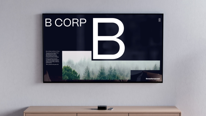
The rebranding reflects the agency’s commitment to its five-year strategy following the 2018 MBO and builds upon its successful track record in the health and wellbeing sector. The agency has played a vital role in facilitating transformations for brands and businesses in this arena, notably the NHS.
The dedication to social purpose at the core of the agency had already been illustrated through helping organisations with development of wellbeing-centric brands and sensitive campaigns, shedding light on their services to support vulnerable communities, including survivors of female genital mutilation (FGM) and individuals recovering from substance use disorder.
The rebrand was guided under the leadership of Managing Director Rachel Cook and Partners (co-owners and creative directors) Chris Skelton and Paul McGuigan - all of whom were involved in the MBO. To learn more, we caught up with Chris to go behind the brand.
What was the brief for the rebrand?
It was an internal brief to re-energise the branding not only to reflect progressive changes post-MBO but to also signify a significant shift to becoming a specialist agency.
The decision to rebrand was inspired by our need to embody the progressive, strategic and analytical approach that we take.
How did the initial pitch/brainstorming phase go?
To begin with, there was some debate about whether we needed to re-brand at all. But, after we'd spent time working through our strategy following our MBO, and articulating where we wanted the business to be, it became clear that rebranding was the right thing to do. From there, our first step was to focus on finding the right name before embarking on the visual identity.
Describe the purpose of the brand and its target audience
The rebrand aligns with our recent strategic shift towards specialising in brand transformation primarily within the health and wellbeing sector.
We’re moving from a brand and design agency to a strategic transformation consultancy that uses brand as our tool to make and support critical organisational change for health and wellbeing brands.
What was your thinking behind the rebranding solution?
This change presented us with a great opportunity to signify that change outwardly, which is where the new name and visual identity came in. We also want to speak to the attitude we have as a business; ThreeTenSeven is progressive, creative, analytical and bold, and the name and identity as was just couldn’t pull that off as easily.
The name was inspired by a Jim Rohn quote about creativity that resonated with us — “There are only three colours, ten digits and seven notes; it’s what we do with them that’s important” — it’s packed with symbolism and sentiment. The joy of a great name and clear positioning — as we often extol to clients — is that it then provides plenty of food for a great new visual identity that, again, has meaning.
The new strategic positioning is reflected in the redesign of our visual identity, which we hope communicates the business’ revitalised personality. It’s important that it feels appropriate to clients new and old, that it feels relevant to and motivational for the current team, as well as appealing to diverse recruits — so we embarked on an agile and collaborative process involving much of the studio team along the way..
Did you learn anything new during the project?
We didn't necessarily learn anything new per se, however, it was an enlightening experience to take the whole team through the same process that we take clients — you don't often get the opportunity to do it on yourselves and it gave us a renewed empathy with the complexity of a rebrand, especially one that includes a name change.
What was the biggest challenge? How did you overcome it?
As I'm sure many agencies would agree, committing to a solid block of time to work through the creative, in and amongst client work, was always going to be a challenge. But we addressed that head-on, blocking out a period of time for the creative team to focus exclusively on the re-brand – a true design sprint, creating, testing and iterating at pace.
What kit/tools/software were used to create it?
We used the usual adobe creative suite plus Cinema 4d for the 3d renders and Figma for the website.
What details are you most proud of and why?
Getting to the finish line!
But also the fact that we successfully developed a full graphic system for ourselves, which you don't see many agencies or consultancies do — it's usually bare bones visual identity — we did a comprehensive job that's inspiring the team to work harder on the implementations and ensure everything is as on brand as possible
What visual influences fuelled your solution?
In a round-about way we were influenced by some of the world’s best brand agencies and management consultancies — because those are the worlds that we straddle — but that mostly manifested itself in the way that we speak about our services and structure our content. From a visual identity perspective, we really just tried to come at it from a deep understanding of our personality and how we need to position the business — so no specific visual influences to speak of.
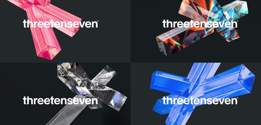
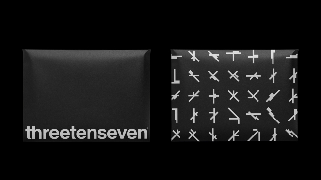
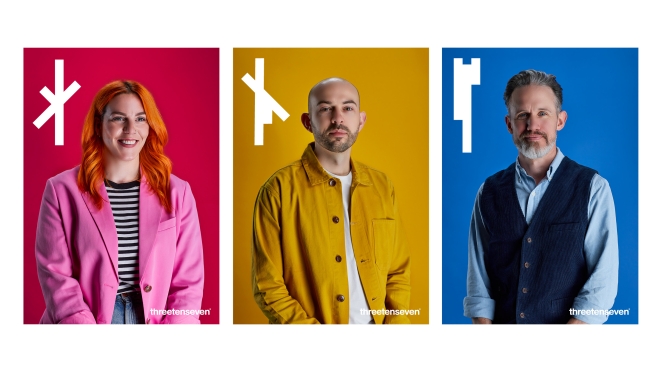
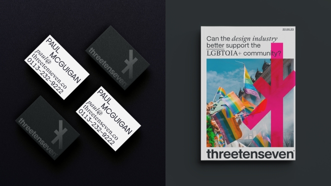
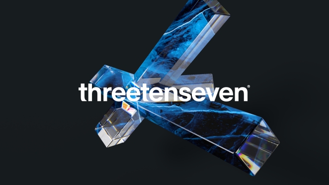
The design process resulted in no-fuss word marque that presents the new (and quite wordy) name in a straightforward but recognisable way. It’s supported by a suite of graphic ‘intersections’ that represent the multitude of relationships and influences that come together to successfully deliver any brand challenge we face, and the intersectionality of audiences and user groups we represent. Those intersecting lines come from building blocks of three, ten and seven components. They bring in our technicality and precision in their form.
In addition, we needed something flexible enough that it could sit alongside client work and not distract, while also having its own energy when used in isolation or as part of the sales process.
What do you hope it achieves for the brand?
We’re already becoming an established agency in the health and wellbeing space, but this rebrand allows us to step into that space with confidence as we embark on a new chapter for our agency.
What would you do differently if you could do it over again?
Not much — I think it went surprisingly well! But if anything, probably more realistic timeframes around certain aspects of the rollout as we hit a couple of delays along the way
Credit list for the work?
Chris Skelton, Creative Director
Rachel Cook, Managing Director
Paul McGuigan, Strategy Director
Nick Hynes, Head of Brand Voice
Ala Kowalczyk, Senior Designer
Al Connolly, Designer